MONERIS REBRANDED CREATIVE PLATFORM
While Moneris is well-known as Canada’s largest payment processor—processing more than one in three transactions—the reflection of their brand throughout their marketing and advertising was scattered and inconsistent. They were leveraging several old campaigns without any consistency.
I initiated a consolidated brand experience across all internal and external collateral leveraging Moneris’ brand colour (teal) and the circle shape within their swoosh logo as a mnemonic.
After launching the unified approach, every expression of the brand was consistent across all internal and external touch-points.
More than five years later, this branded look and feel is still being leveraged.
CREDITS
Client:  Moneris Payment Solutions
Role: Creative Director
Graphic Designer: Tahmina Khan


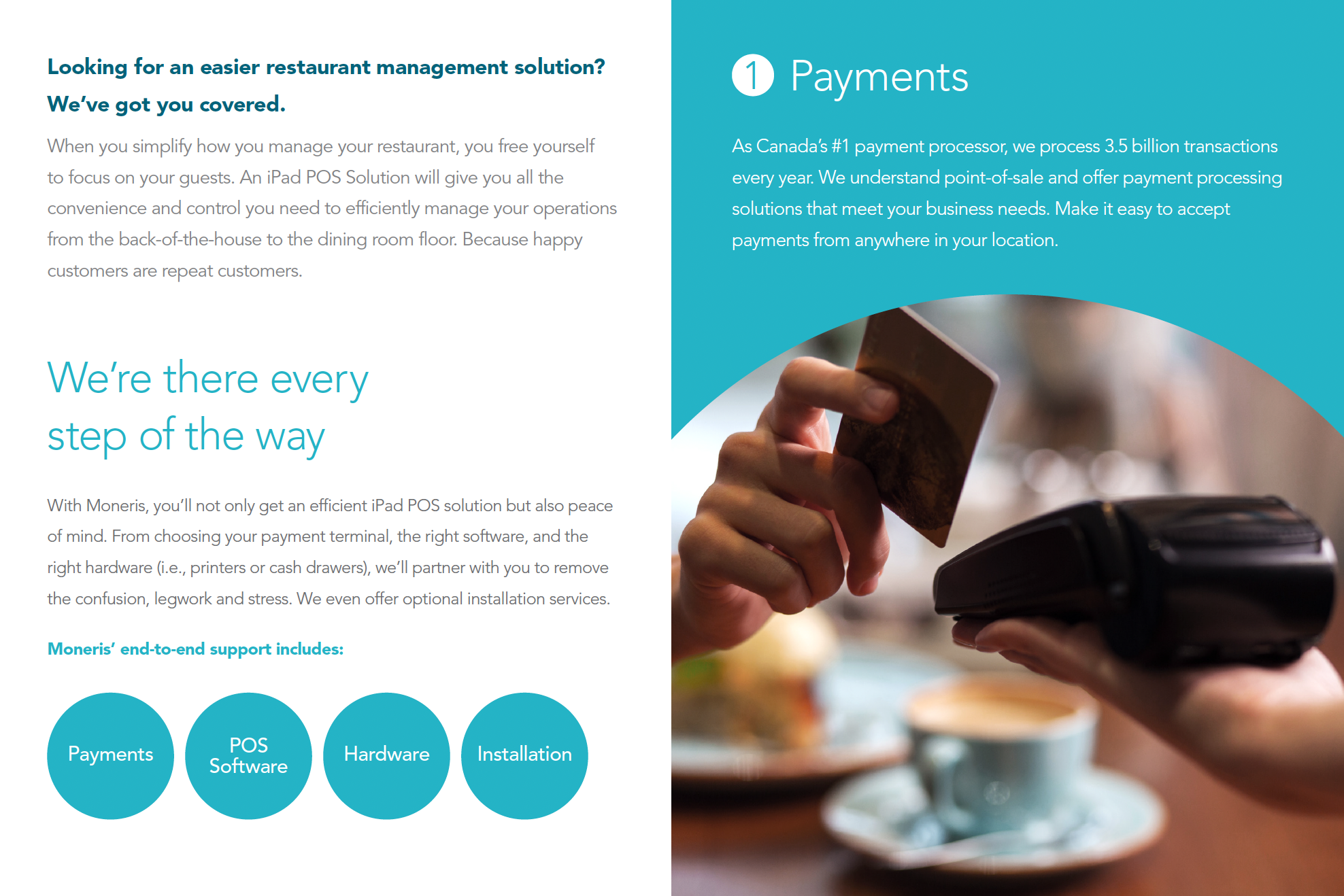

Brochure (samples pages)
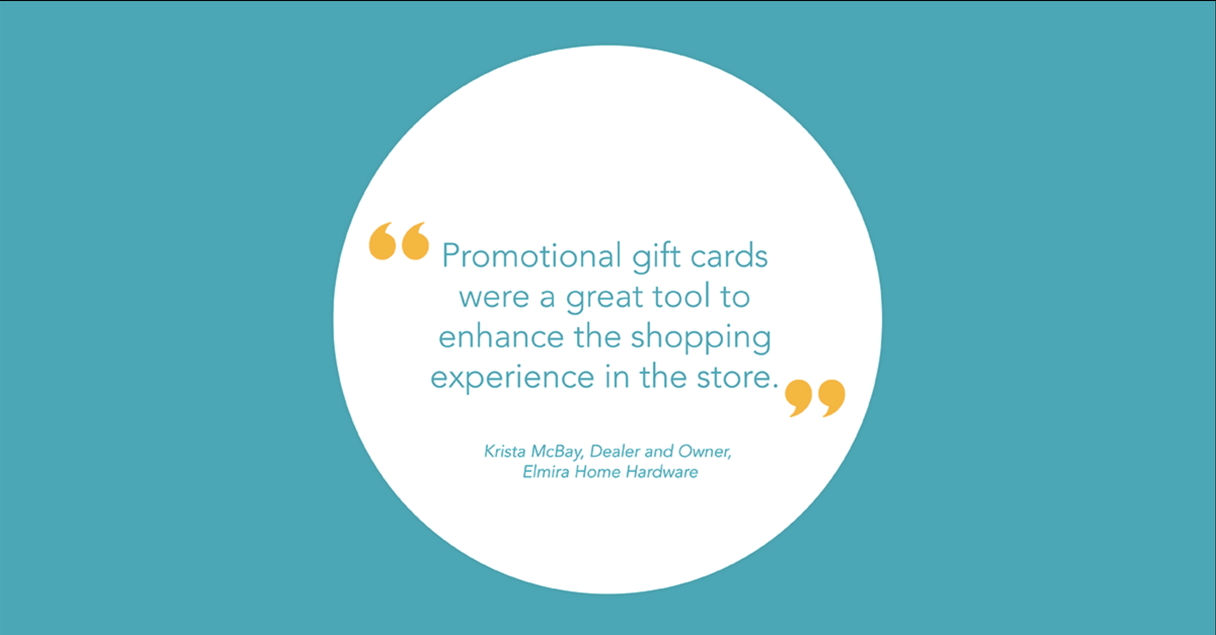

Social Media Content (samples)

OOH (In collaboration with NFA)
“Café Helen” Digital TV (In collaboration with NFA)
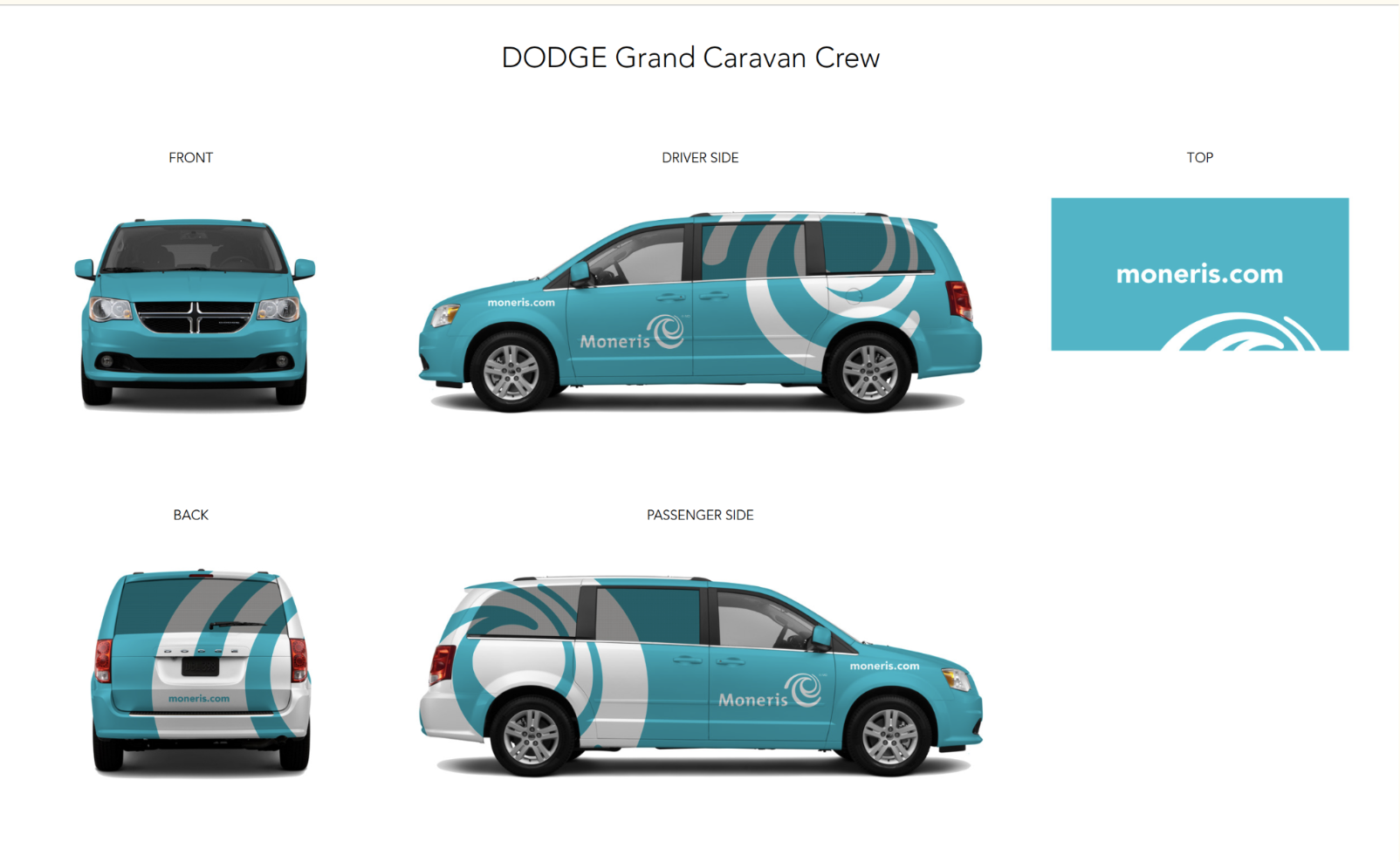

Field Services Truck Wraps


