AM GROUP REBRANDING
CREDITS
Client:  AM Group of Companies
Role: Senior Creative Director/Copywriter
Senior Art Director: Katey-Sue Masales
AM Group of Companies is a third-generation family-owned and operated roofing business. Founded in 1956, the company has since expanded their offerings to include windows and doors, insulation, siding, eavestrough and other exterior services across Ontario.
At GIANT Creative Agency, we led a 4-hour Brand Strategy Workshop with our AM Group clients to better understand their competitive advantages, primary, secondary and tiertiary target demographics, and uncover key insights into what makes their brand unique.
Our Branding Approach:
We shortened the company name to AM Group (instead of AM Group of Companies) and added periods in a.m. so it more intuitively said morning. Lastly, because the clients believed they had established brand equity in their starburst, we presented three concepts, each with a different strategy.
Concept 1
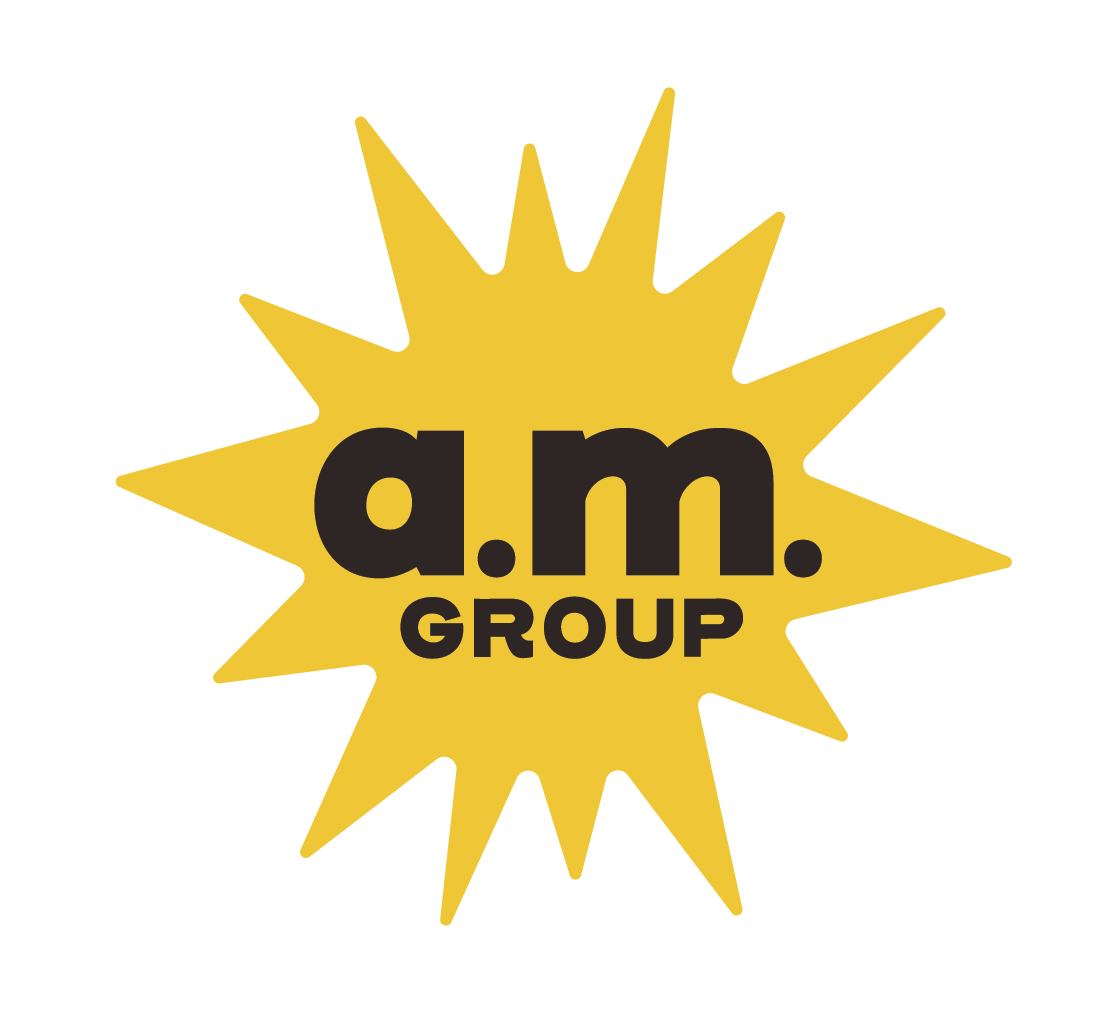
Our first concept leveraged their original starburst shape as-is sun but reimagined it in a more retro way. We also darkened the yellow and added a touch of orange to make it legible on both black and white. A deeper shade of yellow is also friendlier.
The font, Henderson Sans, is a simple font that says so much, from the scoop of the R to the width of the characters. It’s bold and audacious and entirely 1950s.
Concept 2
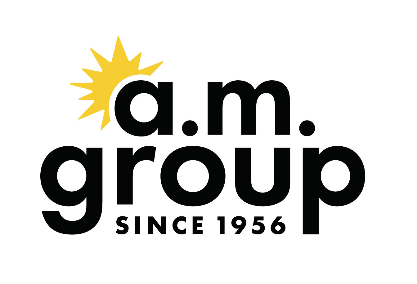
Our second concept added clarity to the brand; we set the sun shape behind the letters to illustrate an early morning sunrise to allude to the meaning of behind the company name and its values. We also included “Since 1956” to create an awareness of its 56 years in business.
The font, Futura, has been a well-used and well-loved font for nearly a century. Circular, geometric shapes make this font approachable and friendly, which is emphasized by lowercase letters and tie back to the brand tone.
Concept 3
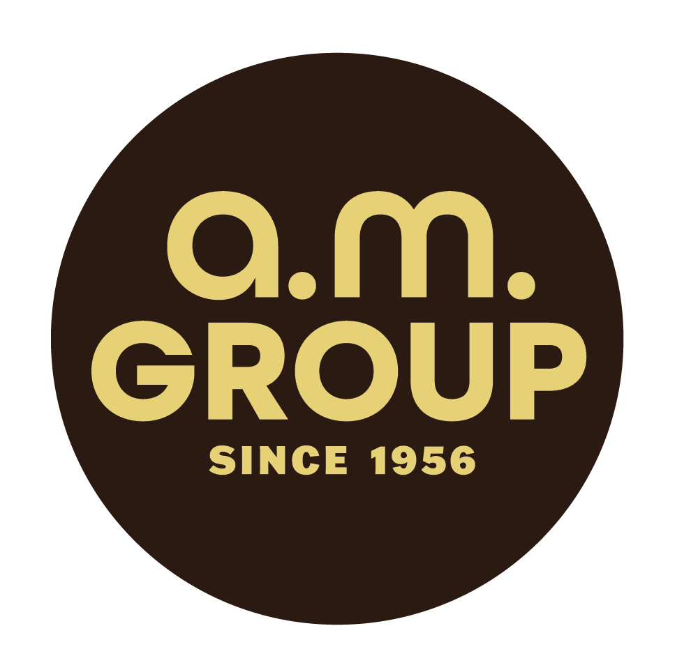
Our third concept truly embraced the style of the 50s, with a simple, rounded modern approach and shades of brown and muted shades. The colours were high contrast colours, for readability purposes, however, we kept them muted and warm to match the decade.
We gave a nod to the sun shape with a simple circle, that acted as a brand stamp. Plus, we paired a lowercase “a.m.” with an uppercase “GROUP” for contrast to emphasize the meaning of morning.
The font, All Round Gothic, uses circular shapes beyond circular letters, like the “m”. It’s friendly and masterful.

Logo in Situ
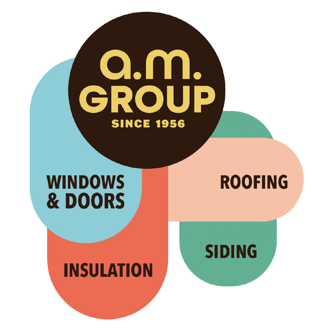
Logo with Services
Results
While the executive team at GIANT Creative decided that these logos were not right for the client, I still firmly believe these were solid options for the client and would have been excellent conversation starters. These clients were reluctant to change their logo. These concepts gradually pushed them out of their comfort zone and would have gradually persuaded them away from their starburst.